2D Overlay System
PNG overlays on a WPF Canvas show live controller state for Xbox, PlayStation, and Nintendo layouts. Custom Extended controllers use a procedurally generated schematic view. Keyboard+Mouse, MIDI, and VR types have dedicated preview views.
Architecture Overview
overlay_positions.py          (SVG parsing + alpha-match refinement)
        |
        v
ControllerOverlayLayout.cs   (auto-generated C# layout data)
        |
        v
ControllerModel2DView.xaml.cs (2D PNG overlay view)

ExtendedSlotConfig.ComputeAxisLayout()
        |
        v
ControllerSchematicView.xaml.cs (procedural Extended view)

KeyboardKeyItem.BuildLayout()
        |
        v
KBMPreviewView.xaml.cs         (keyboard + mouse view)

MidiSlotConfig (NoteCount, CcCount, ...)
        |
        v
MidiPreviewView.xaml.cs         (piano + CC slider view)

2DModels/VRCONTROLLER/ art + VRPreviewView.Elements
        |
        v
VRPreviewView.xaml.cs           (SteamVR left+right hand pair)
When Each View Is Used
PadPage.ApplyViewMode() selects the view. Priority: KeyboardMouse > Midi > Extended > Vr > standard gamepad (2D/3D toggle). Nintendo slots take the last branch, so they get the same 2D/3D toggle as Xbox and PlayStation. ControllerModel2DView draws them from the SWITCHPRO or SWITCH2PRO layout, and ControllerModelView draws the Switch 2 Pro mesh for both profile generations.
| Condition | View | Toggle |
|---|---|---|
OutputType == KeyboardMouse |
KBMPreviewView | Hidden |
OutputType == Midi |
MidiPreviewView | Hidden |
OutputType == Extended |
ControllerSchematicView | Hidden |
OutputType == Vr |
VRPreviewView | Hidden |
OutputType == Xbox, PlayStation, or Nintendo, Use2DControllerView == true |
ControllerModel2DView | Visible |
OutputType == Xbox, PlayStation, or Nintendo, Use2DControllerView == false |
ControllerModelView (3D) | Visible |
VirtualControllerType is Xbox = 0, PlayStation = 1, Extended = 2, Midi = 3, KeyboardMouse = 4, Nintendo = 5, Vr = 6. Numeric values are persisted, so the list is append-only.
A Nintendo slot's mapping grid speaks the raw HID grammar (RawBtn7, RawAxis0Neg) while the preview art speaks the element grammar (ButtonA, LeftThumbAxisXNeg). PadPage.OnModelRecordRequested translates clicks with NintendoPreviewMap.ToRaw, and ControllerModel2DView.UpdateFlashTarget translates the recording target back with NintendoPreviewMap.ToPreview.
ControllerOverlayLayout.cs
File: PadForge.App/Models2D/ControllerOverlayLayout.cs
Auto-generated by tools/overlay_positions.py. Do not edit manually.
Types
public enum OverlayElementType
{
    Button,          // Show/hide on press
    Trigger,         // Clip-based fill level (active-press artwork)
    TriggerBase,     // Rest-state trigger silhouette behind the fill
    StickRing,       // Translates with stick input
    StickClick,      // Quadrant highlight for hover/flash
    FaceButtonGroup, // Reserved (unused)
    Touchpad         // DS4/DualSense touch surface (finger-dot region)
}

public record OverlayElement(
    string ImageFile,
    string TargetName,
    OverlayElementType ElementType,
    double X,
    double Y,
    double Width,
    double Height,
    string HitPath = null
);
HitPath carries the per-pixel hit zone: normalized polygon groups in the form "x,y x,y ...;x,y ...", traced from the overlay PNG's alpha by the generator. TriggerBase rows and image-less rows (the touchpad entries) get no path. The view turns it into a StreamGeometry and assigns it as the hit rectangle's Clip, so hover and click only fire where the art shows.
Xbox360Layout
public static class Xbox360Layout
{
    public const int BaseWidth = 1545;
    public const int BaseHeight = 955;
    public const string BasePath = "2DModels/XBOX360/XB360_base.png";
    public const double StickMaxTravel = 30;
    public static readonly OverlayElement[] Overlays;  // 21 elements
}
Overlay Elements (21 total):
| TargetName | ElementType | Image | Position (X,Y) | Size (WxH) |
|---|---|---|---|---|
| ButtonA | Button | XB360_A_Button.png | 1178, 528 | 127x106 |
| ButtonB | Button | XB360_B_Button.png | 1312, 415 | 122x115 |
| ButtonX | Button | XB360_X_Button.png | 1058, 423 | 126x113 |
| ButtonY | Button | XB360_Y_Button.png | 1190, 314 | 129x118 |
| LeftShoulder | Button | XB360_LeftBumper_Active.png | 138, 134 | 312x141 |
| RightShoulder | Button | XB360_RightBumper_Active.png | 1125, 131 | 285x141 |
| LeftTrigger | Trigger | XB360_LeftTrigger_Active.png | 280, 0 | 137x144 |
| LeftTriggerBase | TriggerBase | XB360_LeftTrigger.png | 280, 0 | 137x144 |
| RightTrigger | Trigger | XB360_RightTrigger_Active.png | 1153, 2 | 137x141 |
| RightTriggerBase | TriggerBase | XB360_RightTrigger.png | 1153, 2 | 137x141 |
| ButtonBack | Button | XB360_BackButton.png | 557, 452 | 92x65 |
| ButtonStart | Button | XB360_StartButton.png | 899, 452 | 92x65 |
| ButtonGuide | Button | XB360_GuideButton.png | 689, 414 | 171x139 |
| LeftThumbRing | StickRing | XB360_LeftStick.png | 204, 448 | 185x165 |
| RightThumbRing | StickRing | XB360_RightStick.png | 908, 684 | 180x160 |
| LeftThumbButton | StickClick | XB360_LeftStick_Click.png | 204, 448 | 185x165 |
| RightThumbButton | StickClick | XB360_RightStick_Click.png | 908, 684 | 180x160 |
| DPadUp | Button | XB360_D-PAD_Up.png | 482, 610 | 110x122 |
| DPadDown | Button | XB360_D-PAD_Down.png | 482, 720 | 110x112 |
| DPadLeft | Button | XB360_D-PAD_Left.png | 410, 672 | 134x105 |
| DPadRight | Button | XB360_D-PAD_Right.png | 530, 672 | 135x105 |
TriggerBase rows carry the rest-state trigger artwork behind the active-press fill. They render at Z=0 (behind the controller body at Z=1), have no hit rect, and are skipped as annotation anchors.
DS4Layout
public static class DS4Layout
{
    public const int BaseWidth = 1466;
    public const int BaseHeight = 783;
    public const string BasePath = "2DModels/DS4/DS4_V2_base.png";
    public const double StickMaxTravel = 25;
    public static readonly OverlayElement[] Overlays;  // 23 elements
}
DS4 reuses DS4_Face_Button.png for all four face buttons at different positions, DS4_OptionsShare_Button.png for Back and Start, and DS4_AnalogStick_Click.png for both stick clicks. LeftTriggerBase / RightTriggerBase (DS4_L2.png / DS4_R2.png) hold the rest-state trigger artwork behind the active fill. The touchpad surface is mapped twice: once as a Button (TouchpadClick hit rect, 482x289 at 492,148) and once as a dedicated Touchpad element (471x200 finger-positioning region at 496,230). Both touchpad rows have an empty ImageFile. The click visual comes from DS4_Touchpad_Click.png (see Touchpad Click Highlight below).
DualSenseLayout
public static class DualSenseLayout
{
    public const int BaseWidth = 1467;
    public const int BaseHeight = 816;
    public const string BasePath = "2DModels/DualSense/DualSense_base.png";
    public const double StickMaxTravel = 25;
    public static readonly OverlayElement[] Overlays;  // 24 elements
}
DualSense uses dedicated glyphs for the four face buttons (DualSense_Cross.png, Circle, Square, Triangle). Adds LeftTriggerBase and RightTriggerBase elements (the un-pulled trigger artwork sits behind the active fill so the trigger animates as a clip-fill instead of a swap) and a ButtonMute element for the mic-mute key. Touchpad surface is mapped twice: once as a Button (TouchpadClick hit rect, 621x322 at 423,160) and once as a dedicated Touchpad element (499x220 finger-positioning region at 484,220, inset for the active touch area).
DualSenseEdgeLayout
public static class DualSenseEdgeLayout
{
    public const int BaseWidth = 1817;
    public const int BaseHeight = 816;
    public const string BasePath = "2DModels/DUALSENSEEDGE/DualSense_base.png";
    public const double StickMaxTravel = 25;
    public static readonly OverlayElement[] Overlays;  // 28 elements
}
Selected when ResolveAssetFolders returns DUALSENSEEDGE, which is any profile id starting dualsense-edge. The Edge folder ships the same sprites as the plain DualSense over a base widened by 350 px so four floating DualSense_EdgeTile.png tiles fit at the margins: LeftPaddle and LeftFunction on the left edge, RightPaddle and RightFunction on the right. Everything else matches DualSenseLayout shifted 175 px right. The Edge gets its own set because a plain DualSense must not render four controls it has no wire for.
XboxOneSLayout
public static class XboxOneSLayout
{
    public const int BaseWidth = 1543;
    public const int BaseHeight = 956;
    public const string BasePath = "2DModels/XBOXONE/XB1_S_base.png";
    public const double StickMaxTravel = 30;
    public static readonly OverlayElement[] Overlays;  // 21 elements
}
Selected for Xbox One, Xbox Elite, and Xbox Adaptive profiles. Trigger elements come as active+base pairs (LeftTrigger/LeftTriggerBase, RightTrigger/RightTriggerBase) so the trigger pull renders as a clipped fill. No Share button overlay. Those profiles do not expose Share.
XboxSeriesXLayout
public static class XboxSeriesXLayout
{
    public const int BaseWidth = 1534;
    public const int BaseHeight = 954;
    public const string BasePath = "2DModels/XBOXSERIES/XBSeries_base.png";
    public const double StickMaxTravel = 30;
    public static readonly OverlayElement[] Overlays;  // 22 elements
}
Selected for Xbox Series profiles. Adds a ButtonShare overlay between View and the dpad. Xbox Series profiles include Share. Older Xbox One / Elite / Adaptive profiles do not.
SwitchProLayout
public static class SwitchProLayout
{
    public const int BaseWidth = 1485;
    public const int BaseHeight = 1079;
    public const string BasePath = "2DModels/SWITCHPRO/NSwitchPro_base.png";
    public const double StickMaxTravel = 25;
    public static readonly OverlayElement[] Overlays;  // 22 elements
}
Selected when ResolveAssetFolders returns SWITCHPRO, which is any profile id starting switch-pro. Triggers come as active+base pairs like the Xbox layouts, since ZL and ZR render as a clipped fill even though the hardware reports them digitally.
Carries ButtonShare for Capture, and its ButtonBack / ButtonStart are Minus and Plus. The overlay set is named by function, not by the labels printed on the shell, so the same target names drive every layout.
Switch2ProLayout
public static class Switch2ProLayout
{
    public const int BaseWidth = 1805;
    public const int BaseHeight = 1079;
    public const string BasePath = "2DModels/SWITCH2PRO/NSwitchPro_base.png";
    public const double StickMaxTravel = 25;
    public static readonly OverlayElement[] Overlays;  // 25 elements
}
Selected when ResolveAssetFolders returns SWITCH2PRO, which is any profile id starting switch2-pro. Same split reason as the Edge: the Switch 2 Pro carries a ButtonC plus the GL / GR grip tiles (NSwitchPro_GripTile.png at LeftPaddle and RightPaddle), and drawing those on an original Pro Controller would show three controls it does not have. The base is widened by 320 px for the two floating grip tiles, and every shared element sits 160 px right of its SWITCHPRO position. The 3D side does not split: both profile generations render the Switch 2 Pro mesh.
SteamDeckLayout and SteamControllerLayout
public static class SteamDeckLayout
{
    public const int BaseWidth = 2241;
    public const int BaseHeight = 933;
    public const string BasePath = "2DModels/STEAMDECK/SD_base.png";
    public const double StickMaxTravel = 22;
    public static readonly OverlayElement[] Overlays;  // 28 elements
}

public static class SteamControllerLayout
{
    public const int BaseWidth = 1466;
    public const int BaseHeight = 1049;
    public const string BasePath = "2DModels/STEAMCONTROLLER/SC_base.png";
    public const double StickMaxTravel = 28;
    public static readonly OverlayElement[] Overlays;  // 19 elements
}
ControllerModel2DView dispatches both, alongside the 2026 Steam Controller. They have two other consumers: WorkshopControllerPreview, which draws the controller a Steam config was authored for (a different device from whatever the user has assigned), and the web controller server (#296), which serves them as the ?type=steamdeck and ?type=steamcontroller layouts.
Both carry dual touchpads (LeftTouchpad / LeftTouchpadClick and the right-hand pair). Steam Deck adds ButtonQuickAccess and four rear paddles. Steam Controller has one stick, so it carries LeftThumbRing with no right-hand counterpart, plus LeftGrip and RightGrip.
Touchpad Click Highlight
The touchpad-click visual is a PNG from the asset pack, not a hand-drawn shape. TouchpadClickSprite(folder) names it: DS4_Touchpad_Click.png for DS4, DualSense_Touchpad_Click.png for both DualSense and DUALSENSEEDGE, null everywhere else. That null is the gate. BuildCanvas builds the touchpad preview for any folder the sprite lookup answers for, rather than naming folders inline, which is what silently excluded the Edge the day it got its own folder. The sprite's stem tracks the art family, not the folder, because the Edge folder carries the DualSense sprites.
BuildTouchpadPreview() loads that PNG via CreateImage at the layout's TouchpadClick rectangle and adds it at Z=6, collapsed by default. It shows at full opacity while TouchpadClickPressed is true, at 0.4 opacity on hover, and toggled by the Map All flash.
Two finger dots (Ellipse, 22 px) render at Z=7 over the touchpad surface:
| Dot | Fill | Source properties |
|---|---|---|
| Finger 0 | orange #CCFF6600 |
TouchpadFinger0X/Y/Down |
| Finger 1 | blue #CC0066FF |
TouchpadFinger1X/Y/Down |
UpdateFingerDot() positions each dot from the normalized touch coordinate against the Touchpad element rectangle (the smaller inset region, not the click rect). Built for DS4, DualSense, and DualSense Edge slots.
PNG Asset Structure
PadForge.App/2DModels/
  XBOX360/  (28 images)
    XB360_base.png                        (1545x955, base controller image)
    Xbox 360 Controller Overlay.png       (composite overlay for refinement tool)
    XB360_A_Button.png, XB360_B_Button.png, ...
    XB360_LeftBumper_Active.png, XB360_RightBumper_Active.png
    XB360_LeftTrigger.png, XB360_RightTrigger.png         (trigger base)
    XB360_LeftTrigger_Active.png, XB360_RightTrigger_Active.png  (trigger fill)
    XB360_LeftStick.png, XB360_RightStick.png
    XB360_LeftStick_Click.png, XB360_RightStick_Click.png
    XB360_D-PAD_Up/Down/Left/Right.png
    XB360_BackButton.png, XB360_StartButton.png, XB360_GuideButton.png
    XB360_base_Black.png                  (colorway base)
    XB360_LeftStick_Black.png, XB360_RightStick_Black.png,
      XB360_LeftTrigger_Black.png, XB360_RightTrigger_Black.png  (colorway rest art)
  XBOXONE/  (34 images)
    XB1_S_base.png                        (1543x956, base controller image)
    Xbox One S Controller Overlay.png     (composite overlay for refinement tool)
    XB1_A_Button.png, XB1_B_Button.png, XB1_X_Button.png, XB1_Y_Button.png
    XB1_LeftBumper_Active.png, XB1_RightBumper_Active.png
    XB1_LeftTrigger.png, XB1_RightTrigger.png             (trigger base)
    XB1_LeftTrigger_Active.png, XB1_RightTrigger_Active.png  (trigger fill)
    XB1_LeftStick.png, XB1_RightStick.png
    XB1_LeftStick_Click.png, XB1_RightStick_Click.png
    XB1_D-PAD_Up/Down/Left/Right.png
    XB1_ViewButton.png, XB1_MenuButton.png, XB1_HomeButton.png
    XB1_S_base_Carbon/PulseRed/ShockBlue.png              (colorway bases)
    XB1_Left/RightStick_PulseRed/ShockBlue.png,
      XB1_Left/RightTrigger_PulseRed/ShockBlue.png        (colorway rest art)
  XBOXSERIES/  (40 images)
    XBSeries_base.png                     (1534x954, base controller image)
    Xbox Series X Controller Overlay.png  (composite overlay for refinement tool)
    XBSeries_A_Button.png, XBSeries_B_Button.png, XBSeries_X_Button.png, XBSeries_Y_Button.png
    XBSeries_LeftBumper_Active.png, XBSeries_RightBumper_Active.png
    XBSeries_LeftTrigger.png, XBSeries_RightTrigger.png   (trigger base)
    XBSeries_LeftTrigger_Active.png, XBSeries_RightTrigger_Active.png  (trigger fill)
    XBSeries_LeftStick.png, XBSeries_RightStick.png
    XBSeries_LeftStick_Click.png, XBSeries_RightStick_Click.png
    XBSeries_D-PAD_Up/Down/Left/Right.png, XBSeries_D-PAD_Center.png
    XBSeries_ViewButton.png, XBSeries_MenuButton.png, XBSeries_HomeButton.png
    XBSeries_ShareButton.png
    XBSeries_base_Carbon/DeepPink/ElectricVolt/PulseRed/ShockBlue.png  (colorway bases)
    XBSeries_Left/RightStick_DeepPink/ElectricVolt/PulseRed/ShockBlue.png,
      XBSeries_Left/RightTrigger_Carbon.png               (colorway rest art)
  DualSense/  (33 images)
    DualSense_base.png                    (1467x816, base controller image)
    DualSense Controller Overlay.png      (composite overlay for refinement tool)
    DualSense_Cross.png, DualSense_Circle.png,
      DualSense_Square.png, DualSense_Triangle.png        (face glyphs)
    DualSense_L1-Active.png, DualSense_R1-Active.png
    DualSense_L2.png, DualSense_R2.png                    (trigger base)
    DualSense_L2-Active.png, DualSense_R2-Active.png      (trigger fill)
    DualSense_LeftAnalogStick.png, DualSense_RightAnalogStick.png
    DualSense_AnalogStick_Click.png                       (shared for both stick clicks)
    DualSense_D-PAD_Up/Down/Left/Right.png
    DualSense_Create_Button.png, DualSense_Option_Button.png, DualSense_Home_Button.png
    DualSense_Mute_Button.png, DualSense_Lightbar.png, DualSense_Gyro-Accel.png
    DualSense_Touchpad_Touch.png, DualSense_Touchpad-Click.png
    DualSense_Touchpad_Click.png          (touchpad-click highlight, used by the 2D view)
    DualSense_base_CosmicRed/GalacticPurple/Midnight/NovaPink/StarlightBlue.png
                                          (colorway bases, no rest-art overrides)
  DUALSENSEEDGE/  (34 images)
    Same file names as DualSense/ (the bases are the wider 1817x816 renders),
    plus DualSense_EdgeTile.png           (the four floating back-button tiles)
  DS4/  (29 images)
    DS4_V2_base.png                       (1466x783, base controller image)
    DualShock 4 Controller V2 Model Overlay.png  (composite overlay for refinement tool)
    DS4_Face_Button.png                   (single image for all 4 face buttons)
    DS4_D-PAD_Up/Down/Left/Right.png
    DS4_L1-Active.png, DS4_R1-Active.png
    DS4_L2.png, DS4_R2.png                (trigger base)
    DS4_L2-Active.png, DS4_R2-Active.png  (trigger fill)
    DS4_OptionsShare_Button.png           (shared for Back and Start)
    DS4_Home_Button.png
    DS4_V2_LeftAnalogStick.png, DS4_V2_RightAnalogStick.png
    DS4_AnalogStick_Click.png             (shared for both stick clicks)
    DS4_Touchpad_Click.png                (touchpad-click highlight)
    DS4_Lightbar_Front.png, DS4_Lightbar_Rear.png  (lightbar preview, #175)
    DS4_V2_base_GlacierWhite/Gold/MagmaRed/MidnightBlue.png  (colorway bases)
    DS4_V2_Left/RightAnalogStick_GlacierWhite/Gold.png       (colorway rest art)
  SWITCHPRO/  (18 images)
    NSwitchPro_base.png                   (1485x1079, base controller image)
    NSwitchPro_FaceButton.png             (single image for all 4 face buttons)
    NSwitchPro_D-PAD_Up/Down/Left/Right.png
    NSwitchPro_L_Bumper.png, NSwitchPro_R_Bumper.png
    NSwitchPro_ZL_Rest.png, NSwitchPro_ZR_Rest.png    (trigger base)
    NSwitchPro_ZL.png, NSwitchPro_ZR.png              (trigger fill)
    NSwitchPro_Plus-MinusButton.png       (shared for Minus and Plus)
    NSwitchPro_HomeButton.png, NSwitchPro_CaptureButton.png
    NSwitchPro_LeftStick.png, NSwitchPro_RightStick.png
    NSwitchPro_AnalogStickClick.png       (shared for both stick clicks)
  SWITCH2PRO/  (19 images)
    Same file names as SWITCHPRO/ (the base is the wider 1805x1079 render),
    plus NSwitchPro_GripTile.png          (the two floating GL / GR tiles)
  STEAMDECK/  (17 images)
    SD_base.png                           (2241x933, base controller image)
    SD_Face_Button.png, SD_D-PAD_Up/Down/Left/Right.png
    SD_L1.png, SD_R1.png, SD_L2.png, SD_R2.png
    SD_View-Menu_Button.png, SD_Guide-QuickMenu_Button.png
    SD_LeftAnalogStick.png, SD_RightAnalogStick.png, SD_Joystick_Click.png
    SD_Touchpad_Click.png                 (shared by both pads)
    SD_CompactTile.png                    (shared by the four rear paddles)
  STEAMCONTROLLER/  (14 images)
    SC_base.png                           (1466x1049, base controller image)
    SC_Face_Button.png
    SC_LeftBumper-Active.png, SC_RightBumper-Active.png
    SC_LeftTrigger-FullPull-Active.png, SC_RightTrigger-FullPull-Active.png
    SC_Start-Select_Button.png, SC_Guide_Button.png
    SC_LeftGrip_Button.png, SC_RightGrip_Button.png
    SC_AnalogStick.png, SC_AnalogStick_Click.png      (one stick only)
    SC_LeftTrackpad_Click.png, SC_RightTrackpad_Click.png
  MOUSE/  (8 images + LICENSE)
    mouse_body.png, mouse_lmb.png, mouse_rmb.png, mouse_wheel.png
    mouse_sideupper.png, mouse_sidelower.png, mouse_line.png, mouse.svg
  VRCONTROLLER/  (15 images)
    VRController_base.png                 (975x726, the hand pair side by side)
    VRController_L_/R_ A, B, Grip, Stick, StickCap, System, Trigger.png
Steam Deck and Steam Controller ship no *_Rest trigger art, so their triggers are single-image elements rather than the active+base pair the Xbox and Switch layouts use. The Steam Deck's D-pad and face art serve the Workshop preview and the web controller's Steam Deck layout, since no PadForge output type resolves to those folders.
All PNGs are declared as WPF Resource (not EmbeddedResource):
They are loaded through EmbeddedBitmaps.Load, which reads the assembly's <assemblyname>.g.resources stream directly. pack:// URIs are not used. They throw "Part URI cannot end with a forward slash" on the .NET 10 single-file publish. EmbeddedBitmaps lowercases the resource path, looks it up via ResourceManager, and returns a frozen BitmapImage (or null, so callers degrade to an empty placeholder instead of crashing). Results are cached per path in a ConcurrentDictionary, negative results included, so a repeated theme rebuild does not re-decode the art. Shared with the PadPage lightbar preview, the mouse glyph, and the Workshop preview.
Source artwork: Gamepad-Asset-Pack by AL2009man (MIT license).
ControllerModel2DView
File: PadForge.App/Views/ControllerModel2DView.xaml, ControllerModel2DView.xaml.cs
WPF UserControl with a Canvas inside a Viewbox for resolution-independent scaling. About 1,046 lines of code-behind, plus a 963-line ControllerModel2DView.Annotations.cs partial that carries the annotation overlay (#175).
XAML Structure
<Grid>
<Viewbox Stretch="Uniform">
<Canvas x:Name="ModelCanvas" ClipToBounds="True" />
</Viewbox>
<!-- Annotation overlay: chips + leader lines, outside the Viewbox
so chip text stays 10 DIP and leaders stay 1 px at any scale -->
<Canvas x:Name="AnnotationCanvas" Visibility="Collapsed" ClipToBounds="True"/>
<!-- Top-right chrome: colorway picker + annotation toggle -->
<StackPanel Orientation="Horizontal" HorizontalAlignment="Right"
VerticalAlignment="Top" Margin="0,8,8,0">
<ComboBox x:Name="AppearancePicker" MinWidth="130" Visibility="Collapsed"
SelectionChanged="AppearancePicker_SelectionChanged" />
<ui:Button x:Name="AnnotationToggleButton" Style="{StaticResource EmberIconButton}"
Click="AnnotationToggle_Click">
<TextBlock x:Name="AnnotationToggleGlyph" FontFamily="Segoe MDL2 Assets"
Text=""/>
</ui:Button>
</StackPanel>
</Grid>
The Viewbox scales the canvas uniformly to fit available space. Canvas dimensions match the layout's BaseWidth/BaseHeight (e.g., 1545x955 for Xbox 360). AnnotationCanvas and the top-right chrome sit outside the Viewbox so they keep a fixed pixel size regardless of the model scale.
Events
Private State
| Field | Type | Description |
|---|---|---|
_vm |
PadViewModel |
Bound ViewModel |
_loadedModel |
string |
One of "XBOX360", "XBOXONE", "XBOXSERIES", "DS4", "DualSense", "DUALSENSEEDGE", "SWITCHPRO", "SWITCH2PRO" |
_loadedColorway |
string |
Colorway id the canvas was built on (null when the folder ships one) |
_colorwayFamilyKey |
string |
Appearance-store key shared with the 3D picker |
_colorwaySet |
Colorway2D[] |
The folder's colorways, held for the picker handler |
_pickerUpdating |
bool |
Reentrancy guard while the picker's items are rewritten |
_dirty |
bool |
Render-frame update flag |
_baseImage |
Image |
Base controller image at Z=1 (above TriggerBase, below overlays) |
_overlayImages |
Dictionary<string, Image> |
Target name to overlay Image element |
_stickTransforms |
Dictionary<string, TranslateTransform> |
Target name to stick translation transform |
_triggerClips |
Dictionary<string, RectangleGeometry> |
Target name to trigger clip geometry |
_elementTypes |
Dictionary<string, OverlayElementType> |
Target name to element type |
_stickHighlights |
Dictionary<string, Image> |
Ring target to stick click overlay image (for quadrant highlights) |
_stickMaxTravel |
double |
Maximum stick overlay travel in pixels |
_flashTimer |
DispatcherTimer |
Flash animation timer (400 ms) |
_flashTarget |
string |
Resolved flash target (ring for axes) |
_flashRawTarget |
string |
Original target before resolution (e.g., "LeftThumbAxisXNeg") |
_flashStickClip |
Geometry |
Stored quadrant clip for stick flash |
_flashOn |
bool |
Current flash toggle state |
_hoverTarget |
string |
Currently hovered target |
_touchpadClickHighlight |
Image |
Full-zone touchpad-click PNG (Z=6), shown while the click is held |
_touchpadFinger0Dot |
Ellipse |
Orange finger-0 dot (Z=7) |
_touchpadFinger1Dot |
Ellipse |
Blue finger-1 dot (Z=7) |
_touchpadOverlay |
OverlayElement |
Layout Touchpad entry used to position the finger dots |
ViewModel Binding
Bind subscribes to PropertyChanged, hooks CompositionTarget.Rendering, calls EnsureModel().
Unbind stops flash, unhooks rendering, clears VM reference.
Model Selection
Resolves the asset folder via HMaestroProfileCatalog.ResolveAssetFolders(ProfileId, OutputType) and dispatches BuildCanvas() against one of eight layout classes:
| Resolved folder | Layout class | Profile family |
|---|---|---|
DS4 |
DS4Layout |
DualShock 4 |
DualSense |
DualSenseLayout |
DualSense |
DUALSENSEEDGE |
DualSenseEdgeLayout |
DualSense Edge |
XBOXONE |
XboxOneSLayout |
Xbox One, Xbox Elite, Xbox Adaptive |
XBOXSERIES |
XboxSeriesXLayout |
Xbox Series |
SWITCHPRO |
SwitchProLayout |
Switch Pro |
SWITCH2PRO |
Switch2ProLayout |
Switch 2 Pro |
| anything else | Xbox360Layout |
Xbox 360 fallback |
Extended slots route to ControllerSchematicView and VR slots to VRPreviewView, so this control sees Xbox, PlayStation, and Nintendo slots.
SteamDeckLayout and SteamControllerLayout live in the same generated file but are not in this switch. WorkshopControllerPreview and WebControllerServer own them.
EnsureModel also resolves the colorway (Controller2DColorways.For(folder) plus the pad's stored appearance) and returns immediately only when both the folder and the colorway match what is already loaded. Otherwise it calls BuildCanvas().
Colorways
File: PadForge.App/Models2D/Controller2DColorways.cs
Generated by tools/gen_2d_colorways.py. Each Colorway2D carries an id, a display name, a base render, and an override map from stock sprite file to recolored file. Entry 0 is the default.
| Folder | Family key | Colorways |
|---|---|---|
DualSense |
DualSense |
White, Midnight Black, Cosmic Red, Galactic Purple, Nova Pink, Starlight Blue |
DUALSENSEEDGE |
DualSenseEdge |
same six |
DS4 |
DS4 |
Jet Black, Glacier White, Gold, Magma Red, Midnight Blue |
XBOXSERIES |
XboxSeries |
Robot White, Carbon Black, Electric Volt, Shock Blue, Pulse Red, Deep Pink |
XBOXONE |
XboxSeries |
White, Black, Blue, Red |
XBOX360 |
Xbox360 |
White, Black |
| everything else | none | picker hidden |
The family key is the per-pad appearance store's key (PadSetting.Model3DAppearances), the same one the 3D picker writes, so one selection drives both views. BuildCanvas swaps the base render and any rest-art sprite the colorway overrides (trigger silhouettes, stick rings). Press-highlight art is shared across colorways. UpdateAppearancePicker hides the ComboBox when a folder ships fewer than two.
BuildCanvas()
Clears the canvas and rebuilds from layout data. Z-index order, back to front:
| Z | Layer |
|---|---|
| 0 | TriggerBase images (rest-state trigger silhouette, behind the body) |
| 1 | Base controller image |
| 2 | Overlay images (Button, Trigger, StickRing, StickClick) |
| 5 | Stick quadrant highlights |
| 6 | Touchpad-click highlight (PlayStation slots) |
| 7 | Touchpad finger dots (PlayStation slots) |
| 10 | Hit-test rectangles |
The base body sits at Z=1 so it covers the lower portion of the trigger PNG (Z=0), matching the asset pack, where the body renders in front of the trigger. The active-press Trigger fill stays at Z=2 so the fill is fully visible.
Overlay images (Z=2):
For each OverlayElement in the layout:
| ElementType | Initial State | Transform/Clip | Hit rect |
|---|---|---|---|
StickRing |
Visible | TranslateTransform stored in _stickTransforms |
Yes (+MouseMove) |
Trigger |
Visible, empty clip | RectangleGeometry clip stored in _triggerClips (starts at bottom = empty fill) |
Yes |
TriggerBase |
Visible (Z=0) | None. No clip | No |
Button |
Collapsed | None (toggled by SetOverlayVisible()) |
Yes |
StickClick |
Collapsed | None (used as source for quadrant highlights) | No |
Touchpad |
No per-element image | Handled by BuildTouchpadPreview() |
Yes (routes to TouchpadClick) |
All overlay images have IsHitTestVisible = false, so clicks pass through to hit-test rectangles.
Hit-test rectangles (Z=10):
Transparent Rectangle elements with Cursor = Hand and Tag = TargetName. Events:
- MouseLeftButtonDown -> HitArea_Click
- MouseEnter -> HitArea_MouseEnter
- MouseLeave -> HitArea_MouseLeave
- MouseMove -> StickHitArea_MouseMove (stick rings only)
When the element carries a HitPath, BuildHitGeometry() parses it into a StreamGeometry scaled to the rendered size and assigns it as the rectangle's Clip. UIElement.Clip bounds hit-testing as well as rendering, so hover and click only fire where the art shows: a trigger's thin arc, not the empty box around it.
StickClick and TriggerBase elements have no hit rect. Center clicks are handled by the StickRing's detection.
Stick quadrant highlights (Z=5): Created from StickClick overlay images at 40% opacity. Initially collapsed. Used for hover and flash quadrant display.
Image Loading
Loads a PNG through EmbeddedBitmaps.Load(resourcePath) (the .g.resources stream, not a pack:// URI) into a BitmapImage, positioned with Canvas.SetLeft/SetTop. A missing resource returns an empty placeholder Image instead of crashing.
Per-Frame Updates
CompositionTarget.Rendering handler, gated by _dirty. The handler returns early when !IsVisible or when AmbientMotionProbe.Instance.IsWindowMinimized, because IsVisible stays true on a minimized window and the repaint would otherwise run per display frame against nothing.
UpdateButtons()
Sets overlay visibility for 22 button targets:
SetOverlayVisible("ButtonA", _vm.ButtonA);
SetOverlayVisible("ButtonB", _vm.ButtonB);
// ... 20 more
Beyond the thirteen shared gamepad targets (four face buttons, four dpad directions, two shoulders, Back, Start, Guide), the list covers ButtonShare (Xbox Series, Switch Capture), ButtonMute (DualSense), ButtonC (Switch 2 Pro), LeftPaddle / RightPaddle (Edge, Switch 2 Pro grips), LeftFunction / RightFunction (Edge), and both thumb-click targets. A layout without an element for a target simply has no entry in _overlayImages, so the call is a no-op. SetOverlayVisible() skips elements currently being flash-animated or hovered.
UpdateTriggers()
Adjusts RectangleGeometry clip for a fill-from-bottom effect:
double clipY = h * (1.0 - v);  // v = 0: empty (clip at bottom), v = 1: full (clip at top)
clip.Rect = new Rect(0, clipY, w, h - clipY);
UpdateSticks()
Updates TranslateTransform.X/Y from normalized stick values:
Raw short values (-32768–32767) are normalized to -1–1. StickMaxTravel is 30 px for Xbox 360, 25 px for DS4.
Click-to-Record
For non-stick elements, fires ControllerElementRecordRequested with the Tag value. For stick rings, calls DetermineAxisFromQuadrant():
Determines axis from click position relative to ring center:
- Center (distance < 30% of radius). LeftThumbButton or RightThumbButton
- Dominant X (|dx| >= |dy|). LeftThumbAxisX or LeftThumbAxisXNeg
- Dominant Y. LeftThumbAxisY or LeftThumbAxisYNeg
Down = positive Y (screen coordinates). Step 3's NegateAxis inverts this so screen-down maps to game-down.
Hover Highlight
Buttons:
HitArea_MouseEnter shows overlay at 40% opacity. HitArea_MouseLeave sets _dirty = true to restore state on the next render frame.
Triggers:
During hover, clip is opened to full image (Rect(0, 0, w, h)).
Stick Rings:
StickHitArea_MouseMove tracks mouse position and builds a CombinedGeometry clip on the stick highlight image:
- Full ellipse (ring boundary)
- Minus center ellipse (30% radius.stick button area)
- Intersected with half-rectangle based on dominant axis direction
This produces a quadrant wedge following the mouse:
var quadrant = new CombinedGeometry(GeometryCombineMode.Intersect,
    fullEllipse, new RectangleGeometry(halfRect));
clip = new CombinedGeometry(GeometryCombineMode.Exclude,
    quadrant, centerEllipse);
For center hover (distance < 30%), shows just the center ellipse.
Flash Animation (Map All)
Target resolution:
- Stick axis targets resolve to ring: "LeftThumbAxisX" -> "LeftThumbRing"
- Stick button targets also resolve to ring: "LeftThumbButton" -> "LeftThumbRing"
- All others pass through
Flash timer: 400 ms DispatcherTimer toggles _flashOn.
| Element Type | Flash On | Flash Off |
|---|---|---|
| Stick axes | Quadrant highlight visible (with stored clip) | Quadrant highlight collapsed |
| Stick ring | Opacity 1.0 | Opacity 0.2 |
| Buttons | Overlay visible, full opacity | Overlay collapsed |
| Triggers | Clip opened to full fill | Clip closed to empty |
| TouchpadClick | Touchpad-click highlight visible, opacity 1.0 | Highlight collapsed |
A trigger flashes through its clip, full to empty, the same channel its live level uses. Toggling Visibility there instead left the image collapsed whenever the flash stopped on an off phase, because StopFlash's trigger branch only resets the clip.
Stick quadrant clip for flash:
Returns pre-computed clip geometry for the given axis direction:
- LeftThumbButton / RightThumbButton. Center ellipse (30% radius)
- AxisX / AxisXNeg. Right or left half-ellipse minus center
- AxisY / AxisYNeg. Bottom or top half-ellipse minus center
Stored in _flashStickClip and re-applied every tick to guard against clearing by other interactions.
Touchpad Live Preview
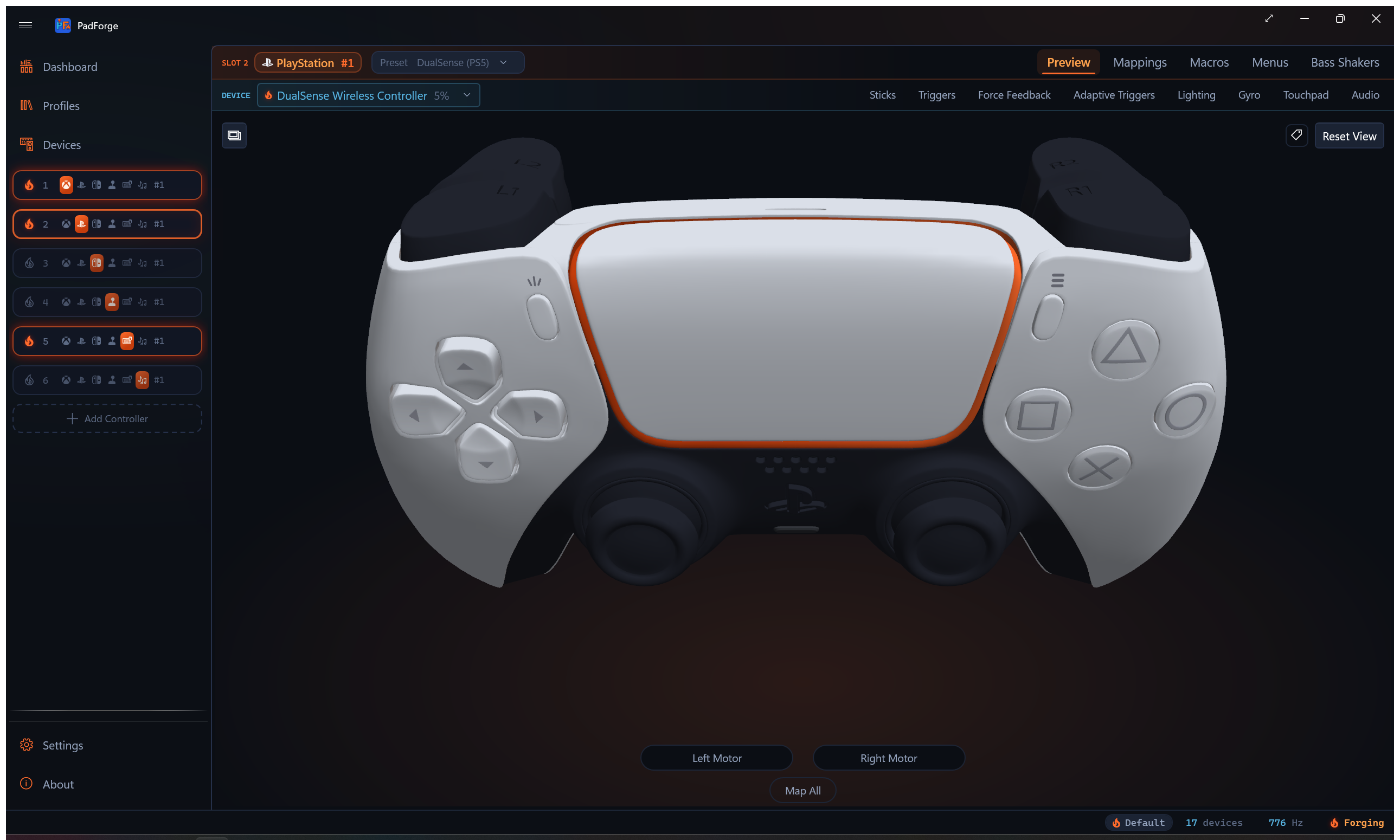
Built for DS4 and DualSense slots by BuildTouchpadPreview(), updated each frame by UpdateTouchpadPreview().
_touchpadClickHighlight: the touchpad-click PNG at the layoutTouchpadClickrect. Visible while_vm.TouchpadClickPressedis true, hidden otherwise. Skipped when the touchpad is hovered or flash-claimed so those interactions win the frame._touchpadFinger0Dot/_touchpadFinger1Dot: orange and blue dots.UpdateFingerDot()shows a dot whenTouchpadFingerNDownis true and centers it on_touchpadOverlay.X + normX * Width,_touchpadOverlay.Y + normY * Height.
Annotation Overlay (#175)
ControllerModel2DView.Annotations.cs (a partial of the same class) draws one mapping chip per row at the canvas edge, with a 1 px cold leader line to the control anchor, an ember output dot, and a hover detail strip. Off by default. The hosting page pushes the session state in on bind.
Constants (identical to the 3D view's annotation layer):
| Constant | Value |
|---|---|
AnnotationChipHeight |
20 |
AnnotationChipGap |
6 |
AnnotationEdgeMargin |
8 |
AnnotationDetailMaxRows |
12 |
| Timer interval | 150 ms |
Anchors come from the active layout table: SetAnnotationAnchors() stores each overlay's rect center by TargetName, skipping TriggerBase rows. ResolveAnnotationAnchor() falls back from a direct name to the stick ring for LeftThumbAxisX/Y and RightThumbAxisX/Y. LayoutAnnotations() translates every anchor through the live Viewbox transform, splits chips into left and right columns, then runs a two-pass slot assignment (downward greedy, upward overflow fix) so chips never overlap. Re-layout is event-driven (size change, rebuild, source-text refresh), not per-frame. The 150 ms timer only expires flashes and evaluates ember dots.
AnnotationToggleButton (glyph E8EC, top-right) flips AnnotationsEnabled and raises AnnotationsToggled. Chip clicks raise AnnotationChipNavigateRequested with the row's TargetSettingName.
ControllerSchematicView
File: PadForge.App/Views/ControllerSchematicView.xaml, ControllerSchematicView.xaml.cs
Procedurally generated view for custom Extended controllers. Displays stick circles, trigger bars, POV compasses, and button grids. About 938 lines of code-behind.
XAML Structure
Same Viewbox > Canvas pattern as the 2D overlay view. Canvas dimensions computed dynamically to fit all widgets.
Events
Brushes
Most colors are theme-aware resource keys, applied with SetResourceReference so WPF re-resolves them on a light/dark switch. Two semantic colors (recording flash, hover) stay fixed.
| Name | Value | Usage |
|---|---|---|
AccentKey |
"AccentFillColorDefaultBrush" |
Pressed/active elements, stick dot, trigger fill |
DimKey |
"ControlStrokeColorDefaultBrush" |
Inactive borders |
BgKey |
"ControlFillColorDefaultBrush" |
Widget backgrounds |
LabelKey |
"TextFillColorSecondaryBrush" |
Text labels |
FlashBrush |
#FFA500 |
Recording flash highlight (fixed) |
HoverBrush |
#FFA24D |
Hover highlight, ember family (fixed) |
There is no separate stick-dot brush. The dot uses AccentKey.
Ember Bloom Glow (#175)
Lit rig elements carry a static frozen DropShadowEffect (EmberGlow blur 12, EmberGlowSmall blur 8, color #FF6B2C, ShadowDepth 0). A SetGlow(element, glow) helper attaches or clears it, never animating. During per-frame render the glow follows the lit state: on a deflected stick dot (EmberGlowSmall), a non-empty trigger fill, and a pressed button circle. The KBM and MIDI views use the same EmberGlow/SetGlow pattern on pressed keys, mouse buttons, and live CC fills.
Layout Constants
const double StickSize = 100;     // Stick circle diameter
const double TriggerWidth = 24;   // Trigger bar width
const double TriggerHeight = 80;  // Trigger bar height
const double PovSize = 60;        // POV circle diameter
const double ButtonSize = 22;     // Button circle diameter
const double SectionGap = 24;     // Horizontal gap between widget sections
const double LabelHeight = 18;    // Space reserved for labels above widgets
const double LayoutPadding = 12;  // Canvas edge padding (Padding collides with the framework property)
const int ButtonsPerRow = 8;      // Button grid wrap count
Widget Structs
private struct StickWidget
{
    public int AxisXIndex, AxisYIndex;
    public Ellipse Dot;                    // Position indicator dot
    public Polygon DirectionArrow;         // Flash/hover direction arrow
    public Canvas ArrowCanvas;             // Arrow container for rotation
    public Ellipse OuterCircle;            // Outer boundary circle
    public double X, Y;                    // Canvas position
}

private struct TriggerWidget
{
    public int AxisIndex;
    public Rectangle Background;           // Border rectangle
    public Rectangle Fill;                 // Fill bar (grows from bottom)
    public double X, Y;
}

private sealed class PovWidget
{
    public int PovIndex;
    public Polygon Arrow;                  // Direction arrow polygon
    public Ellipse Outer;                  // Outer boundary circle
    public RotateTransform Rotate;         // Retained transform, mutated per change
    public string FlashPrefix;             // Prebuilt "RawPovN"
    public int LastPov = int.MinValue;     // Transition-only repaint
}

private sealed class ButtonWidget
{
    public int ButtonIndex;
    public Ellipse Circle;                 // Button circle
    public int LastPressed = -1;           // -1 unknown, else 0/1
}
POVs and buttons are reference types with a retained transform and a last-painted value because the repaint used to allocate a fresh RotateTransform per POV per frame, and SetResourceReference re-resolves the key on every call with no equality short-circuit. Both now paint only on a transition. The arrow still lives inside a fixed-size Canvas so RenderTransformOrigin (0.5, 0.5) lands on the POV center, but the widget holds the transform rather than the container.
ViewModel Binding
Also subscribes to _vm.ExtendedConfig.PropertyChanged so the layout rebuilds when axis/button counts change.
Property change handling:
- RawHidOutputSnapshot -> sets _dirty flag
- OutputType or ProfileId -> calls RebuildLayout() (the explicit ProfileId rebuild covers the case where the incoming profile's layout already matches ExtendedConfig, so no ExtendedConfig.PropertyChanged fires)
- CurrentRecordingTarget -> calls UpdateFlashTarget()
- Any ExtendedConfig property -> calls RebuildLayout()
RebuildLayout()
Clears all widget lists and canvas children, then recreates widgets.
Axis index assignment via ExtendedSlotConfig.ComputeAxisLayout():
- stickAxisX[] / stickAxisY[]. HID axis indices for each stick pair
- triggerAxis[]. HID axis indices for standalone triggers
Layout flow (left to right, starting at x = LayoutPadding):
+-- Sticks --+-- Triggers --+-- POVs --+
|            |               |          |
| Stick 1    | T1  T2        | D-Pad    |
| [circle]   | [bar][bar]    | [circle] |
|            |               |          |
+---- Buttons (wrapped grid, below main row) ----+
| [1][2][3][4][5][6][7][8]                        |
| [9][10][11]...                                  |
+------------------------------------------------+
Canvas dimensions fit all widgets plus padding, enabling Viewbox auto-scaling.
Widget Creation Methods
CreateStickWidget
Creates:
1. Outer circle (Ellipse). Dim stroke, dark background, hand cursor
2. Crosshair lines (Line x2). Horizontal and vertical at 50% opacity
3. Position dot (Ellipse). 10 px accent-colored dot at center
4. Direction arrow (Polygon inside Canvas). Hidden until flash/hover, rotated via RotateTransform
5. Label (TextBlock). "Stick N" above the circle
Hover: MouseMove on the outer circle determines quadrant from mouse position, shows direction arrow with HoverBrush, highlights stroke.
Click-to-record quadrant detection:
| Condition | Target |
|---|---|
\|dx\| > \|dy\|, dx > 0 |
RawAxis{axisXIdx} (positive X) |
\|dx\| > \|dy\|, dx <= 0 |
RawAxis{axisXIdx}Neg (negative X) |
\|dy\| > \|dx\|, dy > 0 |
RawAxis{axisYIdx} (positive Y = down) |
\|dy\| > \|dx\|, dy <= 0 |
RawAxis{axisYIdx}Neg (negative Y = up) |
CreateTriggerWidget
Creates:
1. Background (Rectangle). Dim stroke, dark fill, rounded corners, hand cursor
2. Fill bar (Rectangle). Accent-colored, height 0 initially, grows from bottom
3. Label. "TN" above the bar
Click-to-record: fires RawAxis{axisIdx}.
CreatePovWidget
Creates:
1. Outer circle (Ellipse). Dim stroke, dark background
2. Arrow (Polygon inside Canvas). Triangular, rotated around POV center, initially hidden
3. Label. "D-Pad" (1 POV) or "POV N" (multiple)
Hover: direction arrow rotated to mouse quadrant (0/90/180/270 degrees).
Click-to-record: quadrant detection fires RawPov{index}Up, Down, Left, or Right.
CreateButtonWidget
Creates:
1. Circle (Ellipse). Dim stroke, dark background, hand cursor
2. Label (TextBlock). Button number (1-indexed) centered in circle
Click-to-record: fires RawBtn{index}.
Click-to-Record Target Names
| Widget | Target Format | Quadrant-Based |
|---|---|---|
| Stick | RawAxis{X} / RawAxis{X}Neg |
Yes (X vs Y, positive vs negative) |
| Trigger | RawAxis{N} |
No |
| POV | RawPov{N}Up / Down / Left / Right |
Yes (4 cardinal directions) |
| Button | RawBtn{N} |
No |
Per-Frame Rendering
CompositionTarget.Rendering handler reads RawHidOutputSnapshot from PadViewModel. Like the 2D view it returns early when hidden or when the window is minimized.
Sticks:
double nx = (raw.Axes[w.AxisXIndex] - (double)short.MinValue) / 65535.0;  // 0–1
double dotX = w.X + nx * (StickSize - 10);
Maps RawHidState.Axes[index] from signed short (-32768–32767) to 0–1 normalized, positioning the dot within the stick circle.
Triggers:
double value = (raw.Axes[w.AxisIndex] - (double)short.MinValue) / 65535.0;  // 0–1
double fillH = Math.Clamp(value, 0, 1) * (TriggerHeight - 4);
w.Fill.Height = fillH;
Canvas.SetTop(w.Fill, w.Y + TriggerHeight - 2 - fillH);  // Grows from bottom
POVs:
int povValue = raw.Povs[w.PovIndex];  // Centidegrees (0–35900) or -1
if (povValue == w.LastPov) continue;  // transition-only repaint
w.LastPov = povValue;
if (povValue >= 0 && povValue <= 36000)
{
    w.Arrow.Visibility = Visibility.Visible;
    w.Rotate.Angle = povValue / 100.0;  // the retained transform, not a fresh one
}
POV updates are skipped when the widget is hovered or flash-targeted to prevent flickering from competing rotations.
Buttons:
bool pressed = raw.IsButtonPressed(w.ButtonIndex);
int p = pressed ? 1 : 0;
if (p == w.LastPressed) continue;  // transition-only repaint
w.LastPressed = p;
w.Circle.SetResourceReference(Shape.FillProperty, pressed ? AccentKey : BgKey);
SetGlow(w.Circle, pressed ? EmberGlow : null);  // ember bloom while pressed (#175)
Fills are set with SetResourceReference against the theme keys, not fixed Brush objects, so a light/dark switch re-resolves them in place.
Flash Animation
400 ms DispatcherTimer, same interval as all other views. Strips "Neg" suffix for matching, then checks each widget list:
| Widget | Flash On | Flash Off |
|---|---|---|
| Stick | FlashBrush stroke, 2.5 px, direction arrow visible (FlashBrush fill), rotated to target axis |
DimKey stroke, 1.5 px, arrow hidden |
| Trigger | Background rect stroke = FlashBrush, 2.5 px |
Background rect stroke = DimKey, 1 px |
| Button | Circle stroke = FlashBrush, 2.5 px |
Circle stroke = DimKey, 1.5 px |
| POV | Arrow visible, FlashBrush fill, rotated to target direction |
Arrow collapsed, AccentKey fill |
The trigger flash colors the background rect's border, not the inner fill bar. A resting trigger's fill has zero height, so recoloring it would show nothing.
POV direction mapping:
string dir = target.Substring($"RawPov{w.PovIndex}".Length);  // "Up", "Down", "Left", "Right"
double angle = dir switch
{
    "Up" => 0,
    "Right" => 90,
    "Down" => 180,
    "Left" => 270,
    _ => 0
};
KBMPreviewView
File: PadForge.App/Views/KBMPreviewView.xaml, KBMPreviewView.xaml.cs
WPF UserControl for Keyboard+Mouse virtual controllers. Displays a full QWERTY keyboard above a mouse graphic. About 575 lines of code-behind.
XAML Structure
<Grid>
    <Grid.RowDefinitions>
        <RowDefinition Height="3*"/>      <!-- Keyboard -->
        <RowDefinition Height="2*"/>      <!-- Mouse below -->
    </Grid.RowDefinitions>

    <Viewbox Grid.Row="0" Stretch="Uniform" Margin="8,8,8,4">
        <Canvas x:Name="KeyboardCanvas" Width="556" Height="136" ClipToBounds="True"/>
    </Viewbox>

    <Viewbox Grid.Row="1" Stretch="Uniform" HorizontalAlignment="Center" Margin="8,4,8,8">
        <Canvas x:Name="MouseCanvas" Width="160" Height="195" ClipToBounds="True"/>
    </Viewbox>
</Grid>
Keyboard Canvas
BuildKeyboardCanvas() generates Border elements per key from KeyboardKeyItem.BuildLayout() (full ANSI QWERTY with numpad, 556x136 layout units). Each key has:
- CornerRadius(3) rounded corners
- KeyNormalBrush background (semi-transparent gray), KeyPressedBrush (#FF6B2C ember) on press. AccentBrush, used for pressed mouse buttons and movement, is the same ember, not blue. This preview shows what the virtual keyboard and mouse emit, so pressed states light ember (#175).
- ToolTip with the row's current TargetLabel from _vm.Mappings, falling back to the key's own label
- MouseLeftButtonDown fires ControllerElementRecordRequested with "KbmKey{VKeyIndex:X2}"
- Hover: border highlight via HoverBrush
Mouse Canvas
BuildMouseCanvas() calls MouseGlyph.Build(), the one mouse drawing, shared with the Devices page's MousePreviewControl. Nothing here redraws the art. The shell is gaming-mouse vector art from Zergatul.Obs.InputOverlay (MIT), vendored at 2DModels/MOUSE/mouse.svg with its license beside it and rendered into PNG layers by tools/gen_mouse_art.py. Each control is a full-canvas alpha mask over the artwork (the same technique the controller overlays use), so a control lights up without the art being recolored. MouseGlyph.Build returns the live shapes and attaches no handlers. KBMPreviewView owns behavior.
| Element | Target Name | Description |
|---|---|---|
| Mouse body | . | Masked art layer over 2DModels/MOUSE/mouse_body.png |
| LMB | KbmMBtn0 |
Art layer + a hover wash layer + a Path hit shape |
| RMB | KbmMBtn1 |
Mirror of LMB |
| Line work | . | The art's own outline, masked over the theme brush |
| Scroll wheel | KbmMBtn2 |
Art layer for middle-click |
| Scroll up arrow | KbmScroll |
Triangular Polygon on wheel |
| Scroll down arrow | KbmScrollNeg |
Triangular Polygon on wheel |
| Movement circle | KbmMouseX/Y/Neg |
Ellipse with direction arrow, quadrant click detection. Ours, not the art's, sitting in the lower palm |
| Side buttons | KbmMBtn3, KbmMBtn4 |
Art layers on the left body edge (X1, X2) |
Fill on each art layer belongs to the render loop and the flash animation, so hover gets its own layer (LmbHover, RmbHover, and so on) rather than borrowing that channel. Hit-testing gets a third: a masked rectangle hit-tests over its whole rect, not its mask, so LmbHit and friends are real Path shapes.
Movement circle interaction:
- MouseMove determines quadrant and shows direction arrow with HoverBrush
- Click fires KbmMouseX (right), KbmMouseXNeg (left), KbmMouseY (up), or KbmMouseYNeg (down)
- Dot tracks KbmOutputSnapshot.MouseDeltaX/Y within the circle
Per-Frame Rendering
CompositionTarget.Rendering handler reads KbmOutputSnapshot from PadViewModel:
- Keyboard keys: kbm.GetKey(vKeyIndex) -> KeyPressedBrush / KeyNormalBrush, plus EmberGlow while pressed
- Mouse buttons: kbm.GetMouseButton(0/1/2/3/4) -> AccentBrush fill on LMB/RMB/wheel and the X1/X2 side buttons
- Movement dot: the cursor lanes mapped to circle position, accent when non-zero. The rate lanes (gyro, touchpad, flick) report mouse counts rather than a [-1..+1] deflection, so they are normalized by the counts one full deflection is worth before being summed in
- Scroll arrows: kbm.ScrollDelta -> accent fill on up/down arrow
Each surface is skipped while its own target is mid-flash. The wheel fill is also the flash surface for KbmScroll and KbmScrollNeg as well as KbmMBtn2, so its guard names all three.
Flash Animation
400 ms DispatcherTimer, same pattern as other views. Target elements get FlashBrush (orange) on tick, restored on stop.
Events
Same click-to-record pattern as all other views. Bind(vm) / Unbind() lifecycle matches 2D/3D/Schematic views.
overlay_positions.py
File: tools/overlay_positions.py
Python tool that generates ControllerOverlayLayout.cs from Gamepad-Asset-Pack SVG files.
Dependencies
Process
- Parse SVG. Reads labeled elements from each controller's SVG theme file via lxml.
main()runs ten pipelines:process_xbox360,process_ds4,process_dualsense,process_dualsense_edge,process_xbox_one_s,process_xbox_series,process_switchpro,process_switch2pro,process_steamdeck,process_steamcontroller. The two DualSense pipelines share_process_dualsense_family, the Xbox One S and Series pair shares_process_xbox_modern, and the two Switch pipelines share_process_switchpro_family. Each family pair differs only by a margin (the widened base) and a flag for the extra controls. Computes cumulative SVG transforms (translate, scale, matrix) for pixel-space bounding boxes. - Center and fit overlays. Loads each PNG overlay and centers it on the SVG bounding box center.
fit_overlay_to_bboxscales the overlay to the box where needed,stretch_overlay_to_bboxfills it. - Alpha-channel refinement.
refine_with_compositeruns OpenCV template matching (cv2.matchTemplate,TM_CCOEFF_NORMED) against the composite overlay image, then arefine_via_base_templatepass aligns small buttons and bumpers against the base body PNG. (refine_via_alpha_diffis defined for blob-based alignment but is not currently wired into any pipeline.) - Inject trigger bases.
_add_trigger_base_entriesadds aTriggerBaserow for each active-press trigger whose filename carries an_Activeor-Activesuffix, inheriting its final position and size. The Switch Pro and Switch 2 Pro pipelines append theirZL_Rest/ZR_Restrows themselves inside_process_switchpro_familyat template-diff rects, since the ZL/ZR press art has no suffix. Steam Deck and Steam Controller are excluded: their shipped base renders already draw the triggers at rest, and the Steam packs ship no rest-state trigger PNG. - Reorder for hit-test precedence. Trigger and TriggerBase rows are stable-moved to the front of every layout. The view resolves an overlap to the last-added overlay, and every trigger bbox runs tens of pixels down behind its bumper, so triggers emitted after bumpers stole the shared band. Visual stacking is unaffected because Z-indices are explicit in the view.
- Trace hit zones.
_hit_polygonsthresholds each overlay's alpha above 25, dilates it (kernel at least 7 px, or 6% of the smaller dimension) so thin strokes keep a grab margin, runscv2.findContours+approxPolyDP, and emits normalized polygon groups. Results are memoized per file. - Generate C#. Outputs
ControllerOverlayLayout.cswith layout constants, overlay element arrays, hit paths, and stick travel values for all ten layout classes.
Key Functions
def parse_transform(transform_str) -> np.ndarray        # SVG transform -> 3x3 matrix
def get_cumulative_transform(elem) -> np.ndarray         # Walk ancestors for total transform
def element_bbox(elem) -> tuple                          # Single element bbox
def group_bbox(group_elem) -> tuple                      # Combined bbox of group children
def get_element_pixel_bbox(root, label, scale) -> tuple  # Label lookup + pixel conversion
def center_overlay_on_bbox(bbox, overlay_path) -> tuple  # Center overlay on bbox
def stretch_overlay_to_bbox(bbox, overlay_path) -> tuple # Fill the box exactly
def fit_overlay_to_bbox(bbox, overlay_path, scale=1.0)   # Scale overlay to fit the box
def refine_with_composite(composite_path, results, ...)  # Template-match vs composite
def refine_via_base_template(base_path, results, ...)    # Align vs base body PNG
def refine_via_alpha_diff(base_path, composite_path, ...) # Alpha-diff refinement
def _add_trigger_base_entries(results) -> list           # Inject TriggerBase rows
def _hit_polygons(overlay_path) -> str                   # Trace the alpha into hit polygons
def process_xbox360() -> dict                            # Xbox 360 pipeline
def process_ds4() -> dict                                # DS4 pipeline
def _process_dualsense_family(folder, margin, edge)      # Shared DualSense / Edge
def process_dualsense() -> dict                          # DualSense pipeline
def process_dualsense_edge() -> dict                     # DualSense Edge pipeline
def _process_xbox_modern(profile_name, svg_path, ...)    # Shared Xbox One S / Series
def process_xbox_one_s() -> dict                         # Xbox One S pipeline
def process_xbox_series() -> dict                        # Xbox Series X pipeline
def _process_switchpro_family(folder, margin, switch2)   # Shared Switch Pro / Switch 2 Pro
def process_switchpro() -> dict                          # Switch Pro pipeline
def process_switch2pro() -> dict                         # Switch 2 Pro pipeline
def _prepare_steamdeck_base()                            # Build SD_base.png from the pack
def process_steamdeck() -> dict                          # Steam Deck pipeline
def process_steamcontroller() -> dict                    # Steam Controller pipeline
def generate_csharp(layouts, output_path)                # C# codegen for all layouts
generate_csharp takes a layouts list of (class_name, data, base_path, stick_travel) tuples (one per controller) and emits every layout class into a single file. It also writes the OverlayElementType enum and the OverlayElement record at the top, so the record's shape is the generator's, not hand-maintained.
Usage
Expects Gamepad-Asset-Pack/Controller Asset Pack/ as a sibling of the PadForge repository directory.
MidiPreviewView
File: PadForge.App/Views/MidiPreviewView.xaml, MidiPreviewView.xaml.cs
WPF UserControl for MIDI virtual controllers. Displays a piano keyboard for note outputs and vertical CC sliders. About 797 lines of code-behind. The same control also runs in an input mode on the Devices page (see MIDI Input Mode below).
XAML Structure
Same Viewbox > Canvas pattern as the Schematic view. Canvas dimensions computed dynamically to fit all widgets.
Events
Brushes
Ember (#175): this is an output preview surface, so pressed and active states light ember. Several base colors are pre-cached dark/light pairs, swapped by IsDarkTheme. The fixed ember/flash colors are listed with their hex values.
| Name | Value | Usage |
|---|---|---|
AccentBrush |
#FF6B2C ember |
Active CC fill |
WhiteKeyPressedBrush |
#FFA24D |
White key pressed |
BlackKeyPressedBrush |
#C43D0C |
Black key pressed |
HoverBrush |
#FFA24D |
Hover highlight |
FlashBrush |
#FFA500 |
Recording flash highlight |
CcUpPulseBrush |
#33C055 green |
Encoder up detent flood (input mode) |
CcDownPulseBrush |
#E0882A orange |
Encoder down detent flood (input mode) |
DimBrush |
dark #606060 / light #A0A0A0 |
Inactive borders, labels |
BgBrush |
dark #2D2D2D / light #E0E0E0 |
CC bar backgrounds |
LabelBrush |
dark #BBBBBB / light #505050 |
Text labels |
WhiteKeyBrush |
dark #F0F0F0 / light #FFFFFF |
White piano key fill |
BlackKeyBrush |
dark #202020 / light #404040 |
Black piano key fill |
KeyBorderBrush |
dark #404040 / light #B0B0B0 |
Piano key outlines |
There is no AccentDimBrush.
Layout Constants
const double WhiteKeyWidth = 28;
const double WhiteKeyHeight = 120;
const double BlackKeyWidth = 18;
const double BlackKeyHeight = 75;
const double CcBarWidth = 20;
const double CcBarHeight = 100;
const double SectionGap = 20;
const double LabelHeight = 16;
const double LayoutPadding = 12;  // Padding collides with the framework property
Widget Structs
private struct CcSliderWidget
{
    public int CcIndex;
    public int CcNumber;   // actual MIDI CC number (input mode indexes the live array by this)
    public Rectangle Background;
    public Rectangle Fill;
    public double X, Y;
}

private struct PianoKeyWidget
{
    public int NoteIndex;
    public int MidiNote;   // actual MIDI note number (input mode indexes the live array by this)
    public bool IsBlack;
    public Rectangle Rect;
    public Brush NormalBrush;
    public Brush PressedBrush;
    public string FlashName;   // prebuilt "MidiNoteN" (the flash compare
                               // interpolated a string per key per frame)
}
ViewModel Binding
Subscribes to both _vm.PropertyChanged and _vm.MidiConfig.PropertyChanged. Any MidiConfig property change triggers RebuildLayout().
Property change handling:
- MidiOutputSnapshot -> sets _dirty flag
- OutputType -> calls RebuildLayout()
- CurrentRecordingTarget -> calls UpdateFlashTarget()
- Any MidiConfig property -> calls RebuildLayout()
RebuildLayout()
Layout order:
- CC sliders (if
mc.CcCount > 0). Section label + oneCreateCcSlider()per CC output, horizontal. CC numbers frommc.GetCcNumbers(). - Piano keyboard (if
mc.NoteCount > 0). Section label +BuildPianoKeys(). Note numbers frommc.GetNoteNumbers().
Canvas sized to fit both sections.
CreateCcSlider
Creates:
1. Background (Rectangle). Dim stroke, dark fill, rounded corners, hand cursor
2. Fill bar (Rectangle). Accent-colored, height 0 initially, grows from bottom
3. Label. CC number below the bar (centered, 9 pt)
Click-to-record: fires MidiCC{index}.
BuildPianoKeys
Two-pass layout:
1. White keys first. Placed left-to-right, positions stored by MIDI note number.
2. Black keys on top. Offset by WhiteKeyWidth - BlackKeyWidth/2 from the preceding white key, Z-index 10.
Note labels (e.g., "C4", "G5") placed below white keys only. Uses a 12-element IsBlackKey[] array and NoteNames[] for display.
Click-to-record: fires MidiNote{noteIndex}.
Per-Frame Rendering
CompositionTarget.Rendering handler reads MidiOutputSnapshot from PadViewModel:
CC sliders:
double value = raw.CcValues[w.CcIndex] / 127.0;  // 0–1
double fillH = Math.Clamp(value, 0, 1) * (CcBarHeight - 4);
w.Fill.Height = fillH;
Canvas.SetTop(w.Fill, w.Y + CcBarHeight - 2 - fillH);  // Grows from bottom
Piano keys:
bool pressed = raw.Notes != null && w.NoteIndex < raw.Notes.Length && raw.Notes[w.NoteIndex];
w.Rect.Fill = pressed ? w.PressedBrush : w.NormalBrush;
Flash-animated keys are skipped during render to avoid overwriting the highlight.
Flash Animation
400 ms DispatcherTimer, same pattern as all other views.
| Widget | Flash On | Flash Off |
|---|---|---|
| CC slider | Fill color = FlashBrush (orange) |
Fill color = AccentBrush (ember) |
| Piano key | Key fill = FlashBrush (orange) |
Key fill = NormalBrush (white or black) |
CC flash also matches MidiCC{N}Neg targets (negative direction).
MIDI Input Mode (#128)
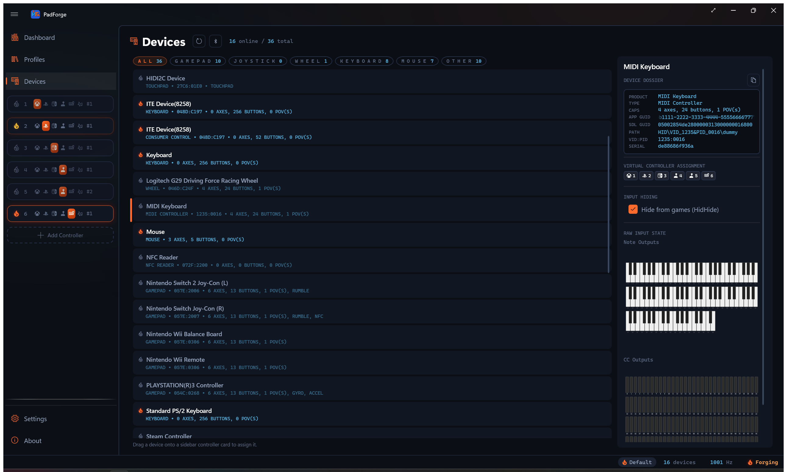
The same control is reused on the Devices page to visualize a MIDI input device's live state. BindInput(Func<MidiInputState> source, InputSection section) swaps it out of the output path: no PadViewModel, no MidiConfig, no click-to-record. UnbindInput() returns it to idle.
InputSection(NotesorCcs) picks which slice to render. The split lets the Devices page place a normal-size section header outside theViewbox, so it does not scale down with the keys.BuildInputLayout()lays out the full 0-127 namespace wrapped: CCs atCcPerRow = 32(four rows), notes by octave atOctavesPerRow = 4(11 octaves across three rows).- Rendering polls
source()every frame (no dirty flag, input changes continuously) and indexes widgets by actual note / CC number against the live arrays. That is whyCcSliderWidget.CcNumberandPianoKeyWidget.MidiNoteexist. - Relative-encoder detents flood a whole CC bar: green (
CcUpPulseBrush) on an up detent, orange (CcDownPulseBrush) on a down detent. A detent's pulse is only ~24 ms, soPulseLatchMs = 180holds the flash long enough to see. - The repaint is skipped when the control is not visible or the window is minimized (
if (!IsVisible || AmbientMotionProbe.Instance.IsWindowMinimized) return;), so the ~256-widget loop does not run against a collapsed panel.
Click-to-Record Target Names
| Widget | Target Format | Quadrant-Based |
|---|---|---|
| CC slider | MidiCC{N} |
No |
| Piano key | MidiNote{N} |
No |
VRPreviewView
File: PadForge.App/Views/VRPreviewView.xaml, VRPreviewView.xaml.cs
Live preview for a VR slot (#49). About 645 lines of code-behind. Same Viewbox > Canvas shape as the schematic and MIDI views, with the canvas named VrCanvas.
One VR slot drives both SteamVR hands, so the art is the pair side by side: 2DModels/VRCONTROLLER/VRController_base.png at 975x726, with a per-element tint layer composited over it.
Elements
A private Elem(File, X, Y, W, H, Target) record table lists twelve elements, six per hand:
| Element | Left target | Right target |
|---|---|---|
| Stick | VrLStick |
VrRStick |
| A | VrLA |
VrRA |
| B | VrLB |
VrRB |
| System | VrLSystem |
VrRSystem |
| Trigger | VrLTrigger |
VrRTrigger |
| Grip | VrLGrip |
VrRGrip |
Tinting uses the Rectangle + ImageBrush OpacityMask idiom: the cutout supplies the shape, one brush supplies the color, so lit, hover, and flash all drive the same layer instead of needing a second "-Active" bitmap per element. Trigger rects cover the whole housing, rather than the blade face alone.
Regions
Every element except System carries more than one mapping target, so every one of them gets a region highlight: a second copy of its overlay at 0.4 opacity, clipped to the region under the pointer or under record. RegionTargetAt() picks the target and RegionClipFor() builds the matching clip.
| Element | Region split | Constant |
|---|---|---|
| Stick | center disc = ...Click, else half-disc X / XNeg / Y / YNeg |
CenterR = 0.3 |
| A, B | inner disc = press, outer ring = ...Touch |
PressR = 0.6 |
| Trigger, grip | body = analog axis, bottom band = ...Click |
ClickBand = 0.3 |
No arrows. Arrows are the schematic view's grammar, not the drawn packs'. Sticks translate their cap, overlay, and region highlight together through one TranslateTransform at StickTravel = 14 px, the branded 25-per-100px-ring ratio at 64 px. Triggers and grips fill from the bottom through a RectangleGeometry clip, the same gas-tank convention ControllerModel2DView uses.
The flash timer is 450 ms here, not the 400 ms the other five views share.
Menu Overlay: Macro Cells and Icon Packs (#390)
The on-screen menu overlay (PadForge.App/Views/MenuOverlayWindow.xaml.cs) draws the ring or grid a MenuDefinitionEntry describes. Two cell-level additions shipped in 4.4.0: a cell can fire a macro by name, and a cell's icon can come from a user-supplied .pficons package or a loose image file.
MenuItemDefinition
File: PadForge.Engine/Menus/MenuDefinitionEntry.cs
public sealed class MenuItemDefinition
{
    [XmlAttribute] public int Index { get; set; }
    [XmlAttribute] public string Label { get; set; } = "";
    [XmlAttribute] public int VirtualKey { get; set; }      // direct key binding
    [XmlAttribute] public int XboxButtons { get; set; }     // direct Xbox mask
    [XmlAttribute] public int ExtendedButton { get; set; }  // direct raw button number
    [XmlAttribute] public string MacroName { get; set; } = "";  // #390 macro cell
    [XmlAttribute] public string Icon { get; set; } = "";       // pficon://, path, or Steam name
    public static bool IsValidIconName(string name);
}
Both new attributes are append-only and default to empty when absent from an older file. MenuDefinitionEntry.Clone() copies them, and the menus clipboard serializes the live entry list with System.Text.Json (InputService.BuildMenusSnapshotJson), so new public properties ride the copy and paste wire with no DTO change.
Macro cells: an additional trigger source
A macro cell is not a separate execution path. The cell is one more trigger source for the named macro, so every macro trigger mode, layer gate, restriction, and pacing rule applies because nothing bypasses EvaluateMacros.
| Step | File | Function |
|---|---|---|
| Stamp | PadForge.App/Common/Input/InputManager.MenuRuntime.cs |
CollectMenuDirectOutputs() runs before the slot evaluators. For every enabled menu item with a non-empty MacroName that IsMenuItemFired reports fired, it resolves the name in MacroSnapshots[slot] (OrdinalIgnoreCase, first match wins) and writes mac.MenuTriggerTick = MacroPassTick. |
| Pass counter | PadForge.App/Common/Input/InputManager.Step4b.EvaluateMacros.cs |
internal long MacroPassTick, incremented once per EvaluateMacros pass. |
| Read | same file, both evaluator twins (gamepad and raw Extended) | menuCellHeld = macro.MenuTriggerTick == MacroPassTick. A macro with no trigger of its own uses menuCellHeld as its whole trigger. Custom Expression ORs it into the formula result. The combo path ORs it into triggerActive beside the button, POV, gesture, descriptor, and axis tests. |
| Skip guard | same | A macro is skipped when !hasOwnTrigger && !menuCellHeld && !macro.IsExecuting && macro.MenuTriggerTick < 0. The !macro.IsExecuting leg keeps evaluating a cell-started run so it completes and releases its latches, since a stamp is one tick wide. The < 0 sentinel keeps a never-stamped, trigger-less macro free. |
Identity is the macro name. Macros carry no id and names are not unique on a slot, so an undeclared name is an inert no-op, the same convention the Switch Layer action uses for a stale layer mask. Renames retag: MacroItem.Name's setter raises the static MacroItem.Renamed event (PadForge.App/ViewModels/MacroItem.cs), each PadViewModel subscribes for its lifetime and OnMacroRenamed (PadForge.App/ViewModels/PadViewModel.cs) filters on PadIndex, rewrites the slot's cells, refreshes the editors, and marks the config dirty.
Editor side (PadForge.App/ViewModels/MenuEditorItem.cs): binding kinds are 0 none, 1 key, 2 button, 3 the read-only row-bound sentinel, 4 macro (MacroKind). BindingKindOptions offers Macro only while MacroNamesProvider returns at least one name or the cell already carries a MacroName. MacroOptions is built per read from the slot's macro names and appends a stale name as a marked entry (Menu_Macro_Missing_Format, "{0} (no such macro)") so the selection never lies. Setting SelectedMacroName clears VirtualKey, XboxButtons, and ExtendedButton, and setting any of those clears MacroName. DropItemIfEmpty counts MacroName as data. The picker's XAML lives in PadForge.App/Views/PadPage.xaml next to the key and button pickers, bound to ShowMacroPicker and Menu_MacroPicker_Tip.
IconPackageManager
File: PadForge.App/Common/IconPackageManager.cs
Mirrors SoundPackageManager leg for leg.
| Member | Value or behavior |
|---|---|
Scheme |
"pficon://" |
FileExtension |
".pficons" |
ImageExtensions |
.png, .jpg, .jpeg, .bmp, .gif (WPF's stock decoder set, shared by the pack probe, the entry lister, and the editor's loose-file gate) |
Packages / PackageRef { Name, Path } |
The registry. Path is exe-relative when the file sits under the application directory, absolute otherwise. |
RegistryChanged |
Raised on every LoadRegistry, Register, and Unregister. The Menus tab refreshes its list on it, and MenuIconResolver drops its cache. |
Register(filePath, out probedName) |
Probes the pack, dedups the display name against other entries with a " (n)" suffix, refreshes an existing entry for the same file. Returns null for a zip with no image entry. |
Unregister(name) |
Removes the entry. The file stays. |
ResolvePackageFile(name) |
Registered name to the resolved file path. |
IsPackageRef / MakeRef / TryParseRef |
The pficon://Package/entry grammar. The first / after the scheme splits package from entry, so a package name never carries a slash. |
TryReadIcon(iconRef) |
Reads one entry's bytes from the zip. Pre-sizes from the declared length up to 1 MB and bounds the copy at 16 MB (MaxIconBytes), both because archive metadata is under the pack author's control. |
ListIcons(name) / ListIconsInFile(path) |
Every entry whose extension is in ImageExtensions, as full entry names. |
ExportPackage(dest, displayName, imageFiles) |
Builds a pack in a .tmp beside the destination and moves it into place. Writes manifest.json first, then each image under its file name with a " (2)" suffix on collisions. |
MakeStoredPath / ResolvePath |
The portability rule: relative under the exe directory, absolute elsewhere. Public because the editor's loose-image pick stores through the same rule. |
Manifest format. A pack is a zip. Any entry named manifest.json (case-insensitive, the shallowest when several exist, FindManifestEntry) may carry a display name:
ProbePackageName reads at most 64 KB of it (MaxManifestChars), takes the name string, replaces / and \ with spaces so the reference grammar survives, and falls back to the file name without extension when the manifest is absent, malformed, or nameless. A zip with no image entry probes to null and is refused.
MenuIconResolver
File: PadForge.App/Common/MenuIconResolver.cs
Resolve(string iconName) returns a frozen, cached BitmapImage or null. Three forms, tested in this order:
| Form | Test | Loader |
|---|---|---|
| Pack reference | IconPackageManager.IsPackageRef |
LoadFromPack: TryReadIcon bytes into a MemoryStream as StreamSource |
| Loose image path | IsLooseImagePath: a /, \, or : in the string plus an ImageExtensions extension, at most 1024 characters. A shape test only. |
LoadFromFile(IconPackageManager.ResolvePath(name)) |
| Steam binding-icon name | MenuItemDefinition.IsValidIconName |
Load: probes IconSubdirs under the Steam install |
Every loader sets DecodePixelWidth = 96 and BitmapCacheOption.OnLoad, then freezes. Misses cache as null so a menu rebuild never re-probes the disk, which is why the whole cache clears on IconPackageManager.RegistryChanged. No loader throws: each catches the decoder's exception set (including FileFormatException) and returns null.
SVG was declined. The overlay renders icons at 30 DIP from a 96 px decode, where a 256 px raster is indistinguishable from vector.
Overlay rendering
MenuOverlayWindow.PlaceCellContent(item, showLabels, index, cx, cy, maxLabelWidth, fontSize, scale) resolves item.Icon through MenuIconResolver.Resolve. A resolved icon is an Image of 30 * Math.Max(scale, 0.7) pixels centered on the cell, raised by iconSize * 0.45 when a label is also shown, with the label placed iconSize * 0.55 below center. A null result renders the label alone, the pre-icon behavior. Icons are not hit-test visible and do not restyle on hover, so only labels register in _cellLabels.
Editor UI
File: PadForge.App/Views/PadPage.xaml.cs
| Handler | What it does |
|---|---|
MenuCellChooseIcon_Click |
Builds a PickSoundDialog item list: Menu_Icon_None when the cell has an icon, then every ListIcons entry of every registered package as pficon:// references. allowBrowse: true adds the file-browser entry. An empty list skips the dialog and browses directly. |
BrowseMenuIconFromDisk |
OpenFileDialog filtered to the image extensions plus *.pficons. A .pficons pick registers the pack and binds its single icon, or prompts with PromptPickFromList when it holds several. An image pick stores IconPackageManager.MakeStoredPath(file). |
IconPackageAdd_Click |
OpenFileDialog for .pficons, then Register. |
IconPackageCreate_Click |
OpenFileDialog (multi-select images, title Pad_Menus_IconPackages_PickImages), SaveFileDialog for the destination, ExportPackage, then Register. |
IconPackageRemove_Click |
Unregister on the selected PackageRef. |
RefreshIconPackages |
Rebinds IconPackagesList and toggles IconPackagesEmptyText. Subscribed to RegistryChanged on load, marshaled through the dispatcher. |
The Icon Packages card sits on the Menus tab (PadPage.xaml, strings Pad_Menus_IconPackages_*) and mirrors the Sound Packages card. The per-cell icon preview binds MenuCellItem.IconImage, which calls MenuIconResolver.Resolve when HasIcon.
Persistence
PadForge.App/Services/SettingsService.cs carries IconPackageData { Name, Path } and AppSettings.IconPackages ([XmlArray("IconPackages")]) beside SoundPackages. Load calls IconPackageManager.LoadRegistry from the array. Save calls SaveRegistry and writes it back. The registry is app-wide, not per profile. Profiles carry only the pficon:// references in their cells.
Profile transfer
File: PadForge.App/Common/ProfileTransfer.cs
A .pfprofile archive bundles icon packs under icons/ with an alias map at icons/_aliases.txt, the same layout sound packages use under packages/.
| Function | Role |
|---|---|
ReferencedIconPackages(profile) |
Distinct package names parsed from every SlotMappingSets[].Menus[].Items[].Icon. |
Export |
Adds each referenced pack's file as icons/<file> and one alias\tfile line per package name to the alias map, so a dedup-suffixed name on the exporting machine still maps to its file. |
TryLandEntry(entry, appDir, fileName, fileExtension) |
The shared landing helper, extracted from the sound path and now used by both package families. Rejects a target outside appDir (ZipSlip). Reuses an existing file only when EntryMatchesFile proves byte-identical content, never name plus size. Renames on a clash with a " (n)" suffix. Copies with a 512 MB bound (MaxPackageBytes) and deletes the partial file on overrun or failure. Returns the landed path or null. |
Import |
For each icons/*.pficons entry: TryLandEntry, then IconPackageManager.Register(target, out probedName). When the alias map names this file, every alias not equal to the registered name is rewritten. Without a map entry, the probed name is rewritten when it differs. |
RewriteIconPackageRefs(profile, from, to, alreadyRewritten) |
Walks SlotMappingSets to Menus to Items, rewrites Icon references whose package matches from to MakeRef(to, entry), and marks each item so a later alias in the same import cannot re-match a reference already moved. |
Tests
PadForge.Tests/IconPackageTests.cs drives real zips in temp directories through the production code. The sound-package layer has no equivalent test.
How All Views Relate
All six views share the same architecture:
- ViewModel interface. Read from
PadViewModel, fireControllerElementRecordRequestedwith PadSetting target names. - Bind/Unbind lifecycle.
PadPage.BindActiveModelView()callsUnbind()on all six, thenBind(vm)on the active one. Only one view processesCompositionTarget.Renderingat a time. - Dirty-flag rendering.
CompositionTarget.Renderinggated by_dirty, set byPropertyChanged. Every handler also returns early while the control is hidden or the window is minimized. - Interactions. Click-to-record, hover highlight, flash animation (Map All). Same target names across views.
- Model selection (2D/3D only).
EnsureModel()resolves the asset folder viaHMaestroProfileCatalog.ResolveAssetFolders(ProfileId, OutputType), which picks one of"DS4","DualSense","DUALSENSEEDGE","XBOXONE","XBOXSERIES","SWITCHPRO","SWITCH2PRO", or"XBOX360". Extended slots route toControllerSchematicViewand VR slots toVRPreviewView, so this logic fires for Xbox, PlayStation, and Nintendo slots.
Key differences:
| Aspect | 3D View | 2D View | Schematic View | KBM View | MIDI View | VR View |
|---|---|---|---|---|---|---|
| Technology | HelixToolkit.WPF | Canvas + BitmapImage | Canvas + WPF Shapes | Canvas + masked PNG art | Canvas + WPF Shapes | Canvas + masked PNG art |
| Rotation | Left-drag turntable | None | None | None | None | None |
| Region detection | 3D ray-cast + position | 2D mouse position | 2D mouse position | 2D mouse position | None | 2D mouse position |
| Flash rate | 400 ms | 400 ms | 400 ms | 400 ms | 400 ms | 450 ms |
| Output type | Xbox, PlayStation, Nintendo | Xbox, PlayStation, Nintendo | Extended | KeyboardMouse | MIDI | Vr |
| Assets | OBJ meshes (EmbeddedResource) | PNG images (Resource) | None (procedural) | PNG images (Resource) | None (procedural) | PNG images (Resource) |
| Config rebuild | Model type change | Model type or colorway change | ExtendedConfig change | OutputType change | MidiConfig change | None (fixed art) |
See Also
- 3D Model System:
ControllerModelView(HelixToolkit 3D alternative to 2D overlay) - ViewModels:
PadViewModelproperties bound by all six preview views - XAML Views:
PadPagehosts and switches between 2D, 3D, schematic, KBM, MIDI, and VR views - Virtual Controllers: Output type determines which preview view is active
- Engine Library:
Gamepad,RawHidState,KbmRawState,MidiRawState,VrRawStatesnapshot structs - Build and Publish: 2D PNG assets (
2DModels/) included as WPFResourceitems
Last updated for PadForge 4.5.0.